🎨 Accessibility Shouldn’t Be an Afterthought
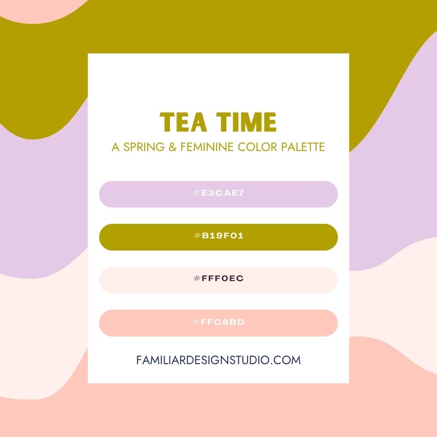
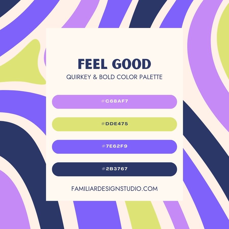
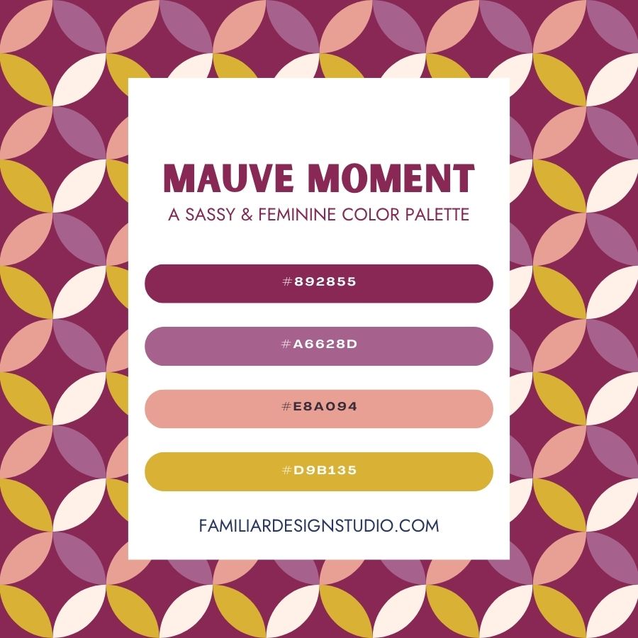
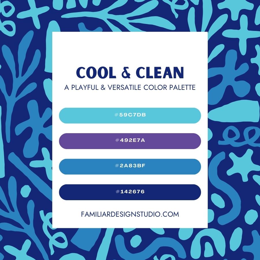
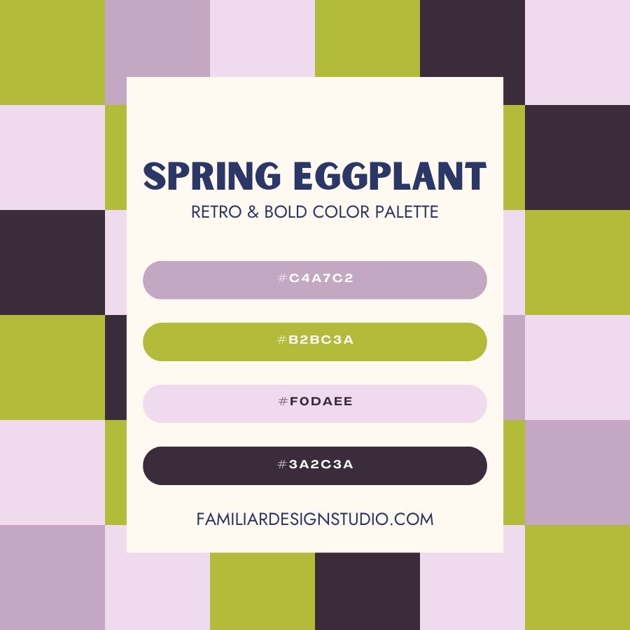
Color is more than just decoration — it’s communication. In branding, your color palette sets the tone for how people perceive your business, whether they realize it or not. At Familiar Design Studio, we believe in building thoughtful, intentional brands — and color plays a starring role. 🌟
💡 Color is a Key Player in Brand Recognition
Think about some of your favorite brands. Chances are, you can picture their colors without even seeing the logo. That’s the power of visual consistency.
A strong color scheme helps you:
- ✅ Create instant recognition
- 💬 Evoke specific emotions
- 🧩 Establish trust and cohesion across all platforms
Whether you want your brand to feel calm and nurturing, bold and energetic, or clean and modern, color helps communicate that vibe before a single word is read.
🎯 Strategic Color Choice = Stronger Connection
Your color palette should reflect both your brand personality and your ideal audience.
💚 Warm earth tones might speak to a holistic wellness brand.
💎 Vibrant jewel tones might attract creatives or bold startups.
When chosen with intention, color becomes a powerful tool for emotional connection and clarity.
♿️ But What About Accessibility?
This is where many brands miss the mark.
Designing for aesthetics alone can unintentionally exclude users — especially those with visual impairments, color blindness, or cognitive challenges. That’s where ADA (Americans with Disabilities Act) compliance comes in.
✅ ADA-compliant color usage means ensuring your brand is:
- 👁️ Readable – High contrast between text and background is crucial, especially for body copy.
- 🧭 Navigable – Colors shouldn’t be the only indicator (e.g., “Click the red button” doesn’t work for someone who can’t see red).
- 🌍 Inclusive – Color choices should accommodate a range of visual abilities without sacrificing style.
💬 Why It Matters
Designing with accessibility in mind isn’t just a legal checkbox — it’s a reflection of your brand values.
An accessible brand is one that’s built to include everyone, not just those with perfect vision. That kind of thoughtfulness builds trust, reflects integrity, and ensures your message reaches a wider audience. 🙌
✨ The Takeaway
When it comes to branding, your color scheme isn’t just about looking good — it’s about showing up well. For everyone. 💛
By pairing strategic design with accessibility, you create a brand that’s both beautiful and usable.
At Familiar Design Studio, we build brands that don’t just turn heads — they welcome people in. 👋
Ready to create a color system that feels like you and serves your audience well?
Let’s make your brand both unforgettable and inclusive.
